Riese & Müller

EUROBIKE 2025 – Brand and Community

Back to project overview

‘Cycling Unites’ – Riese & Müller focussed on the community at the EUROBIKE 2025 with this guiding theme. In addition to the presentation of the latest models, visitors also experienced an open space for dialogue, networking and new ideas at the stand.


The challenge

Riese & Müller, a pioneer in the field of post-fossil individual mobility, combines the highest quality standards and innovative strength with a diverse, vibrant community. These two poles – premium technology and a sense of community – had to be merged into a single, approachable brand experience.


Our approach

The ‘&’ sign is transformed from a connecting element in the brand name into the creative and emotional centre of the entire trade fair presentation. It symbolises the connection between people and mobility, design and function and, above all, the strong community that surrounds the brand.


Skills

Concept, communication, graphic design, architecture, set design, realisation

In social media

Group 15 Created with Sketch.
f_logo_RGB-Blue_1024 3 Created with Sketch.
ic_linkedin Created with Sketch.

Awards:

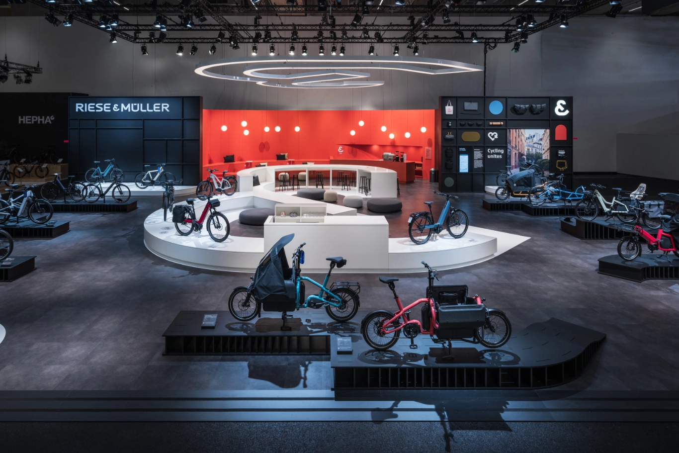
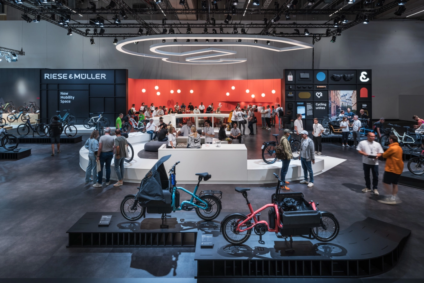
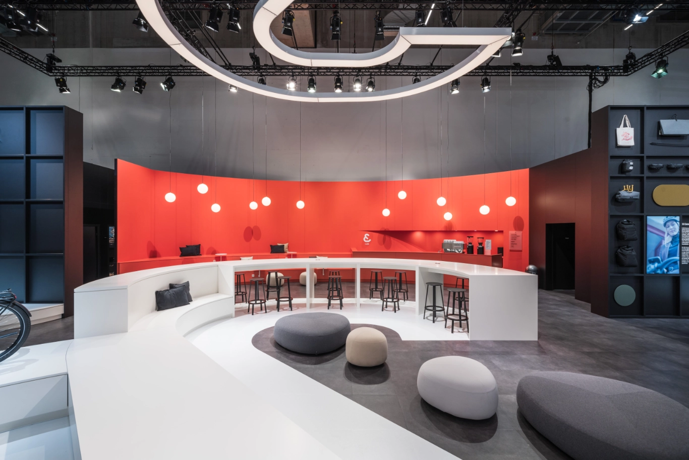
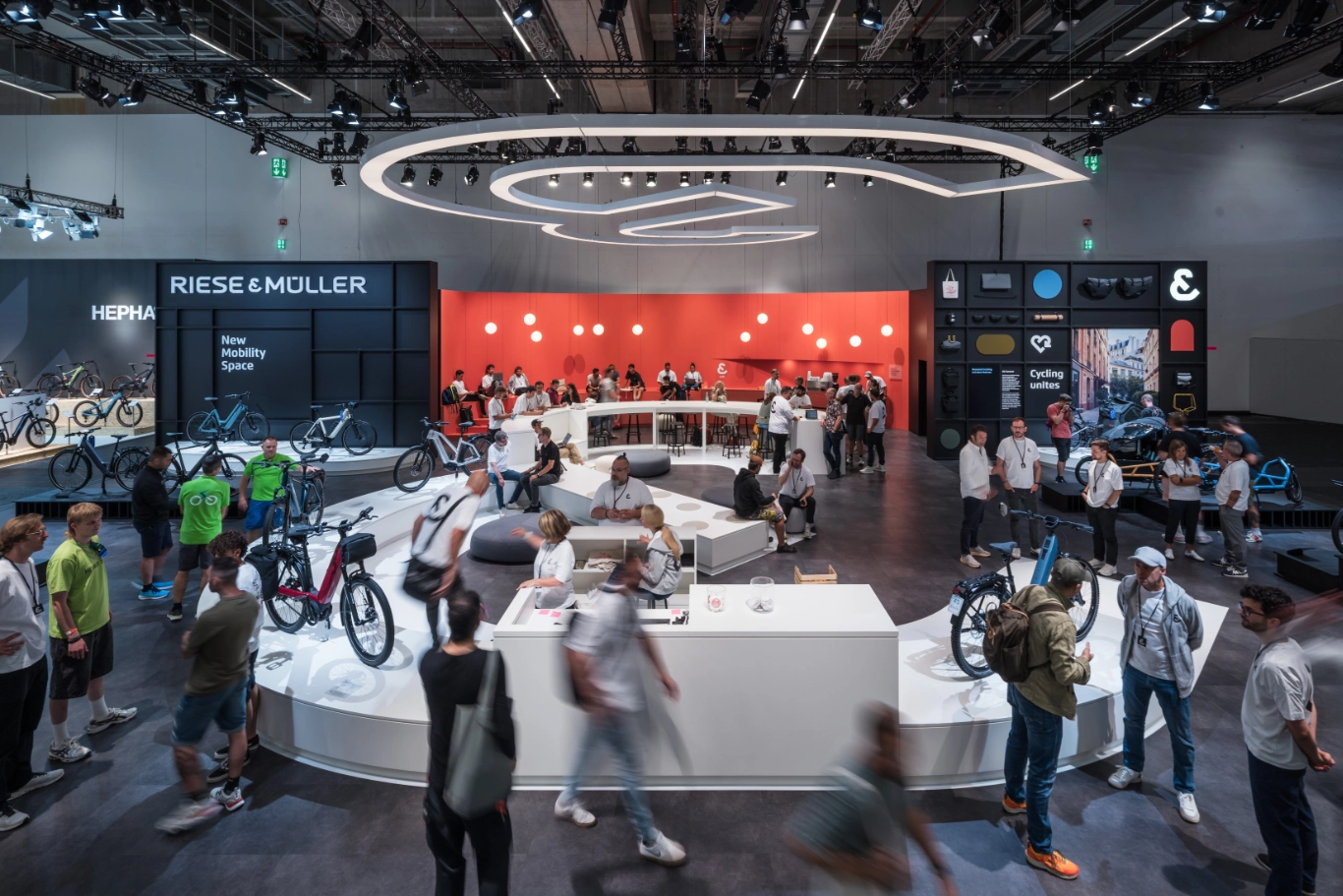
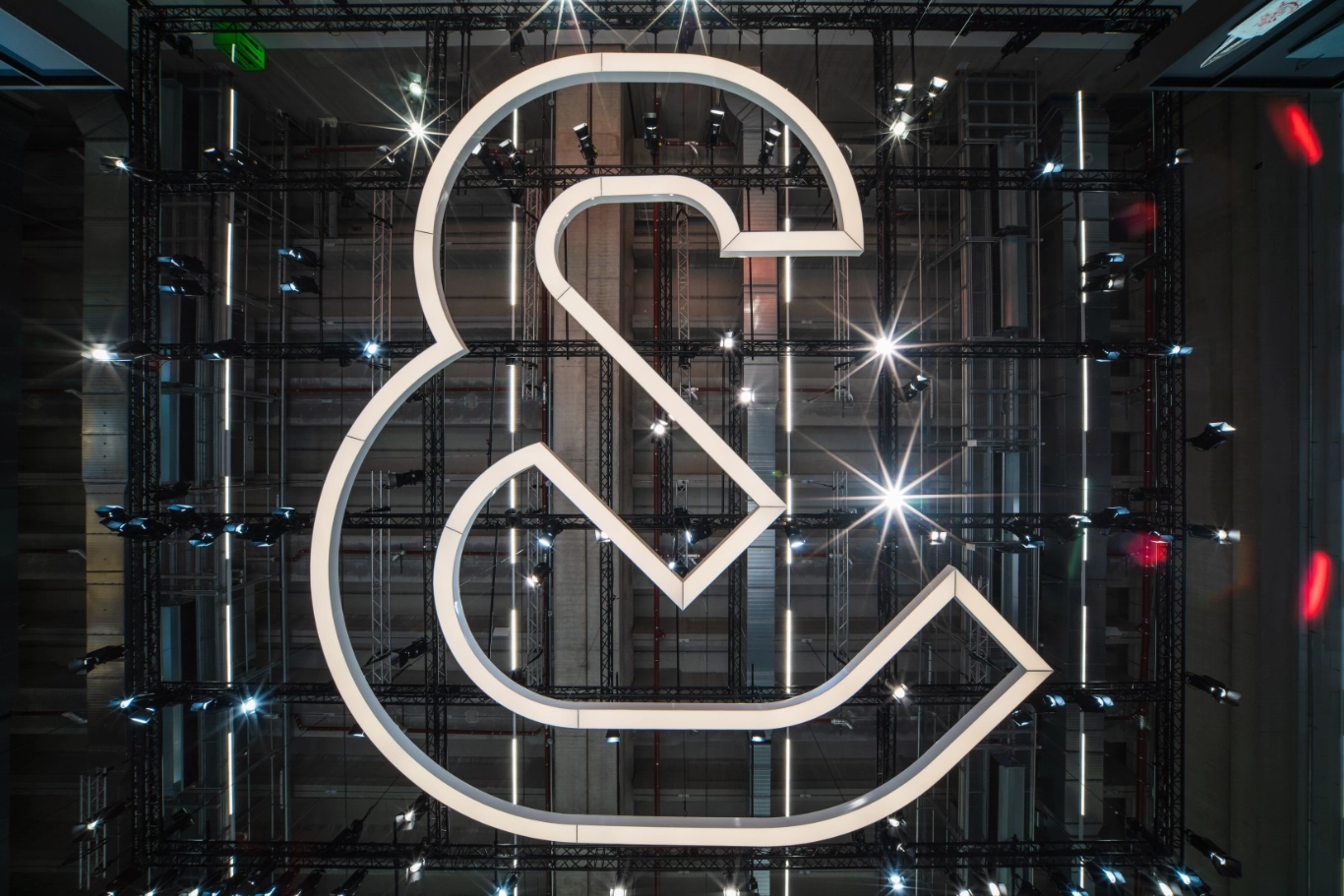
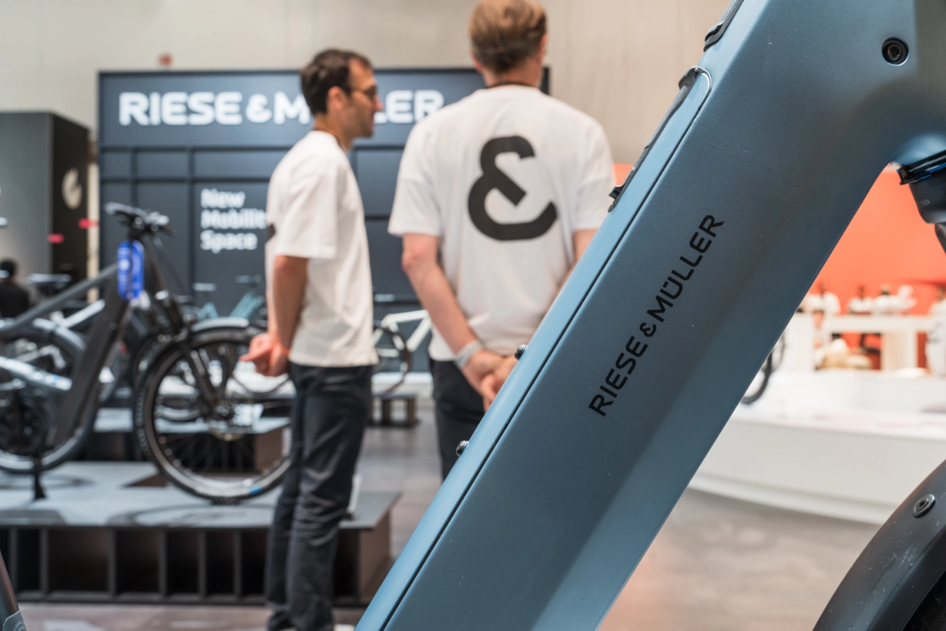
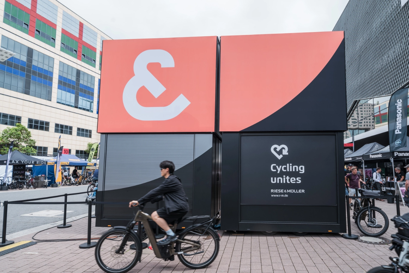
Brand and community as one unit

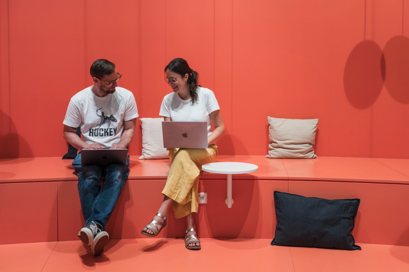
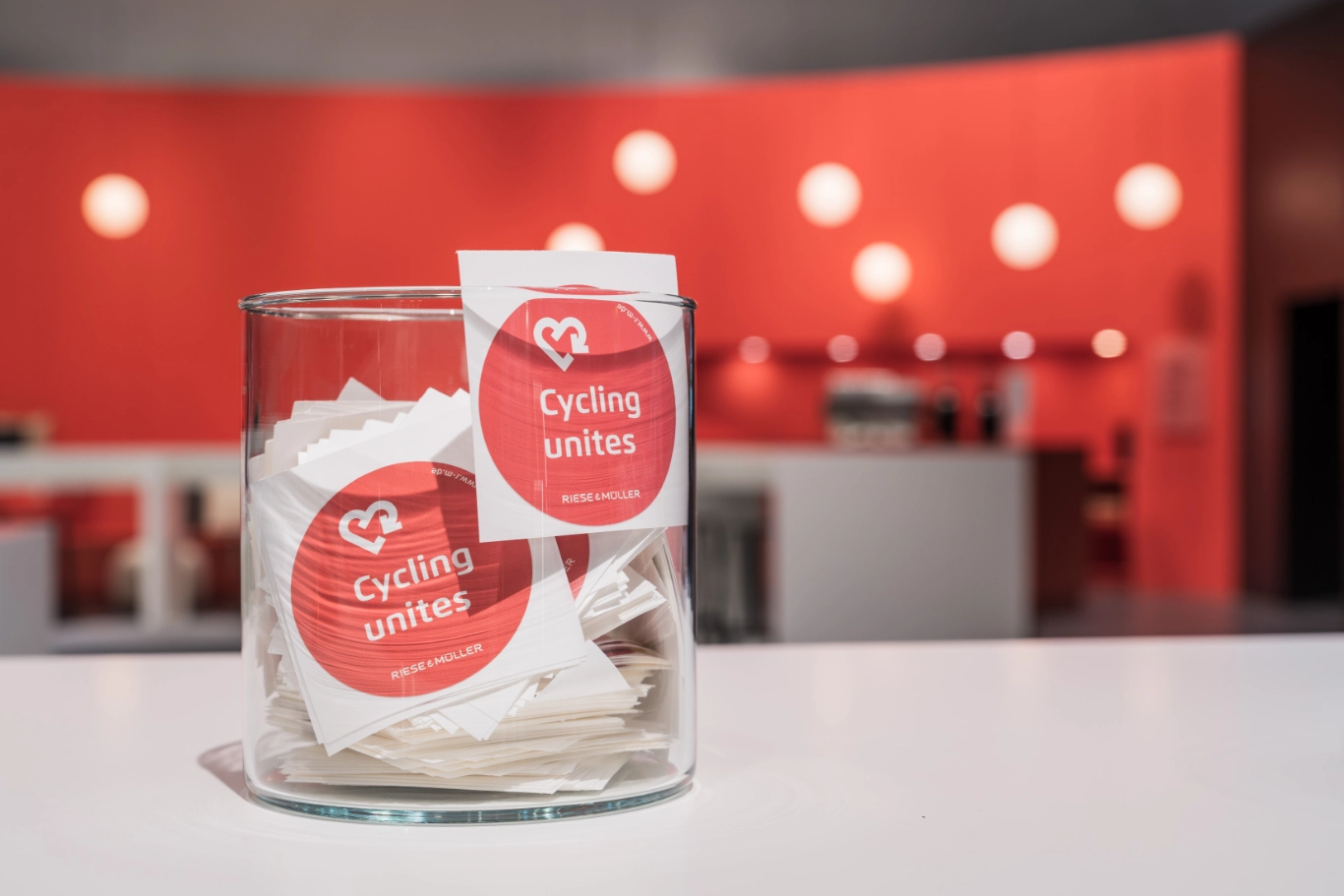
Cycling is moving, inspiring and connects people.This was emphasised by the trade fair appearance of the premium e-bike manufacturer Riese & Müller with the central theme ‘Cycling Unites’ at the EUROBIKE 2025: At the stand, the presentation of new products and the energy of the community merged into a holistic brand experience. The connection between products, brand and community was tangibly translated into the space on various levels using the ‘&’ sign from the brand name.

‘Our community is at the centre of everything we do – so we are all the more pleased to have created a real meeting place at EUROBIKE 2025. Atelier Markgraph‘s concept consistently develops our brand building further and strengthens both our brand presence and the communication of our values and vision.‘

Photo: Riese & Müller, Mühltal

Dr. Sandra Wolf
CEO from Riese & Müller

The ‘&’ as a statement and leitmotif

From a subtle detail of the brand name to the central leitmotif of the trade fair stand: The ‘&’ sign symbolised the togetherness of the community and stood for approachability and hospitality. This leitmotif unfolded on two levels: In the centre, a curved platform landscape in the shape of an ‘&’ invited visitors. It also served as a community space, information counter and product platform. A ten-metre-high ceiling sculpture hovered directly above, creating a symbolic link between people, vision and brand as a mirror image. The ‘&’ symbol was also systematically used in all areas of the stand and thus characterised the visual identity of the entire presentation.

Trade fair appearance as a holistic brand experience

The trade fair appearance was based on a standardised brand concept. This was reflected in all elements – from the stringent brand management and graphic design to the signage system and team clothing. The brand values were communicated via thematic steles as well as visual and textual elements, while an exclusive merchandising collection appealed to the brand‘s fans.

A central element was the link between the brand world and the direct product experience: in the outdoor area with its own test track and 35 test bikes, visitors were able to test ride Riese & Müller e-bikes and experience the fun of riding live.

TRADE FAIR, BRAND EXPERIENCE | STRATEGY, COMMUNICATION, SCENOGRAPHY, EVENT, CURATION, GRAPHIC DESIGN, EXHIBIT DESIGN, SOFTWARE DEVELOPMENT
Credits

Client: Riese & Müller GmbH, Mühltal

Stand construction: mac brand spaces GmbH, Langenlonsheim

Graphic production: Hansen Werbetechnik, Dreieich-Sprendlingen

Ceiling sculpture:: Nordlicht GmbH, Friedrichsdorf

Documentation photos: Kristof Lemp, Darmstadt